
Step 1:
First create a new RGB document that is 500 x 500 pixels. Fill the background color with a
dark gray (I used R:109 G:109 B:109). Next create the object that you want to add the 3D effect to
and make sure it is black. I created this logo in illustrator and saved it as a custom shape in
Photoshop. (you can download it at my website if you want to).
Step 2:
Next, lets skew this a little so it looks as if we are looking at it from an angle. Hit Ctrl + T
to bring up the free transform tool. Then hold Ctrl + Alt + Shift down and pull the bottom handles out a bit. Don't apply the transform yet though.
Step 3:
Now, push the top handles in a bit. Then bring the top middle handle down a bit so we kind
of scrunch the logo.

Step 4:
OK, if you used a custom shape and it is still vectorized now would be a good time to make
a copy of the layer and rasterize one of them by going to Layer->Rasterize->Shape. (You can hide the other - we wont need it. Its just a good idea to have a copy). That said, now we can get to the cool part. Go to Filter->Stylize->Emboss. Enter in these settings. Angle: 135, Height: 3 pixels, Amount:100%.
Step 5:
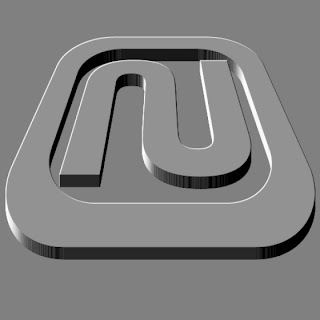
Now the next part is easy. Select the move tool (V). Then while holding down Ctrl + Alt, hit
the up arrow key about 20 times or until you think you have enough depth to your image. You
should have something like the sample here.
Step 6:
Now, select the layer BELOW the last layer (topmost) that was copied. Then continually hit Ctrl + E to merge each layer down with the previous. Do this until all of the logo layers are merged (except for the top one, which should still be on its own layer). Your layers should look something like the layer palette screenshot I have here.
Step 7:
Now double click the top layer and add a gradient overlay layer style to it. Choose the white to black gradient and change its angle setting to 120. Don't close the layer style dialog box yet though.
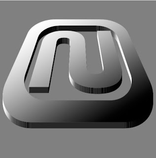
Step 8:
Next, add the color overlay option. I chose a blue color. Use the settings I have in the image here.
Step 9:
Finally, one finishing tough is to add a stroke. This kind of gives it an added chromish feel. Again, use the settings I have in the screenshot here.
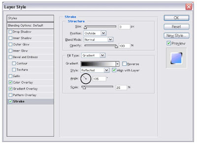
And here is the final image.

As always, use your creativity - this effect can be applied to many objects besides a logo. I hope you enjoy this effect as much as I enjoyed exploring it.


No comments:
Post a Comment