Saturday, May 22, 2010
Cool edges
Step 1:
Open the image, crop it to the subject matter, and then press the M key to select the Marquee selection tool.
Step 2:
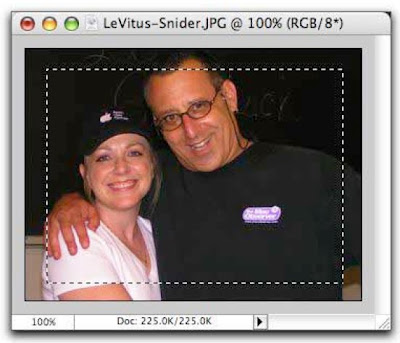
Draw a selection that comes in about 1/4 in. from the edge of your image on all sides (feel free to experiment with this).
Step 3:
From the Selection menu, choose Feather.
Step 4:
Enter a value of 5 (it's in pixels) and click Okay. The larger the number you enter, the larger the feathering effect will be.
Step 5:
Back in the Layers Palette, make sure the background layer is editable (if it's named "Background" and has a padlock on it, simply double click it to rename it). .
Step 6:
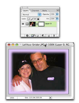
Add a layer mask by clicking the circle within a square icon at the bottom left of the Layers Palette. Poof! Watch the edges disappear. They're still there, though masked. By using a layer mask, you haven't deleted any bits of your image. So if you're not pleased with the results, you can throw away the mask and have another go at it. (I added a purple background layer to make the effect more visible in this example.)
NOTE:
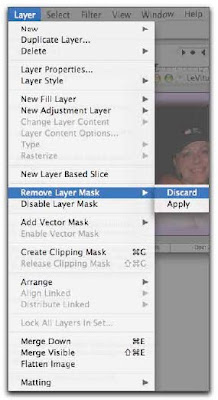
To throw away the mask and begin again, first make sure you're on the layer in which the mask lives in the Layers Palette. From the Layers menu, select Layer Mask > Discard. Presto! The mask is gone and you can have another go at it.
Super funky edges
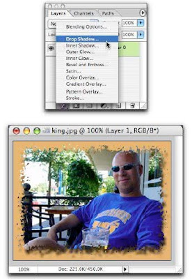
Another way to create cool edges for your images is by using Filters. We're going to use Brushstrokes > Spatter in this example; but, for a truly fun evening, I advocate experimenting with all Filters... especially the artistic ones! We're also going to use layer masking so that we don't harm the image, and so that our drop shadow ends up as funky as our edges :)
Step 1:
Open the image, and, in the Layers Palette, make sure the background layer is editable (if it's named "Background" and has a padlock on it, simply double click it to rename it).
Step 2:
We're going to add a little more work space by choosing Canvas Size from the Image menu.
Step 3:
Change the pull-down menus to percent and enter 10 for both width and height, and click Okay. This should give us some space around all edges.
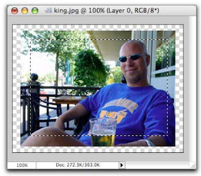
NOTE: If you forget to unlock your "Background" layer in Step 1, you won't be working with a transparent background (gray & white checkered squares), as shown below.
Step 4:
Press the M key to select the Marquee selection tool and draw a selection around the area of the photo that you don't want to mess with (the subject matter).
Step 5:
Add a layer mask by clicking the circle within a square icon at the bottom left of the Layers Palette.
Step 6:
Select just the layer mask, by clicking directly on it in the Layers Palette.
Step 7:
Now from the Filter menu, choose Brush Strokes > Spatter.
Step 8:
Increase the Spray Radius, in the right of the resulting dialogue box, to around 17, and set the Smoothness to 4. Play with these settings until you get what you like in the preview pane and then click Okay. See how the effect was applied to the mask and not the image?
Step 9:
Add a drop shadow for more visual interest by clicking the cursive F at the bottom left of the Layers Palette. (I added an orange-ish background in this one to make the example a bit more dramatic.)
Friday, May 21, 2010
Cloudy frosted text
Step 1:
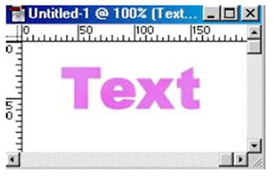
Open a new file, any size. Type some text (works best with thicker sans serif fonts, such as Arial or Helvetica).
Step 2:
Use the Color Picker to choose contrasting foreground and background colors that differ from your text color. For this exercise, I selected "Yellow" foreground and "Red" background.
Step 3:
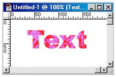
Select FILTER, RENDER, DIFFERENCE CLOUDS. You will be warned "This type layer needs to be rendered before proceeding. Its text will no longer be editable. Render the layer?" Click on OK. Note: Your result may not look exactly like the picture at left. It varies based on the colors you select.
Step 4:
Select FILTER, DISTORT, GLASS. Adjust sliders to desired effect. Preferences for picture at left were: Distortion "10", Smoothness "5", Texture "Frosted", Scaling "100%".
Step 5:
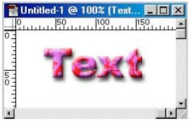
You can then add additional layer effects, such as Drop Shadow or Bevel and Emboss to finish the
look. I used both of those layer effects, with default settings, on the picture at left.
Circular wrap (2)
Step 1:
Open up a file similar to the one we started with last time (Link to last weeks tutorial). Follow step 1 and 2 just as we did last time. You should be left with something like this.
Step 2:
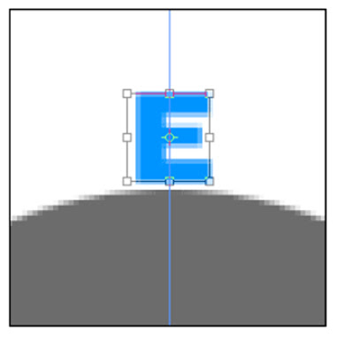
Now, instead of create a shape, create the first letter in whatever word it is you would like to have wrap around a circle. Now just like we did last time in Step 4, zoom in and make sure the center point is aligned with the center vertical guide using the Free Transform tool (Ctrl + T). Hit enter when you're done to apply it.
Step 3:
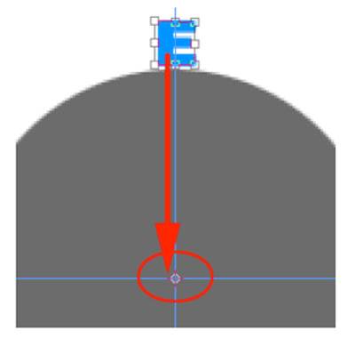
Now duplicate that letter by pressing Ctrl + J. Select the new duplicate layer and go into Free Transform mode by hitting Ctrl + T. Drag the center point from the bounding box down to where the two guides intersect. Don't apply this yet though.
Step 4:
While still in Free Transform mode, move your cursor so it is just outside the bounding box and you see the little curved arrow. This signifies that you will be rotating. Go ahead and rotate the letter to the right until it looks like a good distance away from the first letter. Hit Enter to apply the changes when you are happy with the result.
Step 5:
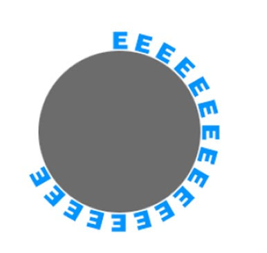
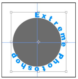
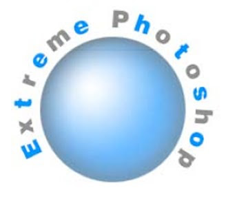
Now the rest is easy. Simply hold down Ctrl + Alt + Shift (Mac: Command + Option + Shift) and the letter "T" all at the same time. That shortcut creates a new layer and continually applies the free transform tool to that new layer based on what you have done previously. Do this for as many layers as there are letters in your word. I'm going to write "Extreme Photoshop" here - for now its just a bunch of E's.
Step 6:
OK, if you followed along, you have a bunch of E's. Not very pretty huh? Just go back and select each layer and change them to the appropriate letter. back and select each layer and change them to the appropriate letter.
Step 7:
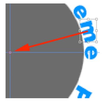
Now, if you noticed, some of the letters didn't quite turn out right when I changed them. They are a little too close while others around it a further away. You can fix this by clicking on the layer of the letter you want to change and going into Free Transform mode again. Just drag that little center thingee to the middle where the two guides intersect and rotate the letter to a place that suites you. Hit Enter when you are happy with its placement. The screenshot here shows me moving the 'm'. I also moved the 'e' after it slightly.
Step 8:
Now put all of these into a layer set. You do this by linking all of the letter layers and going to the layer palette options and selecting "New Set From Linked".
Step 9:
Finally some finishing touches. I'm not crazy about where the words are placed around the circle. Do I have to go and rotate each letter like I did in step 7 you ask? Of course not. We put them all into a layer set so now we can just click on the layer set folder and press Ctrl + T to enter Free Transform mode again. Notice the bounding box around all of the letters now.
Step 10:
To rotate them, just drag that center point thingee to the intersection of the two guides again and rotate until it looks good. Hit Enter when you are done. (Tip: You may have to zoom in, in order to drag the center point. Mine kept trying to snap to a different area - but when I zoomed in I was able to move it more precisely.) One key point here - notice that every time we rotate we are dragging that center point of the bounding box to the center of the document where the two guides intersect. Just remember to do that anytime you want to adjust any/or all of the letters and you will always stay in a perfect circle. Also, if you need to adjust a single letter at a later time, just go in and unlink it from the rest. You'll still be able to select the layer set and rotate all of them if needed.
Step 11:
Well thats about it for this time. Notice how we never rasterized any of the text layers. So now your text is still editable. I can go back and change properties like the font and color whenever I choose. Yeah, I know its a lot of layers to change but note: I didn't say it would be EASY editable text in a circle, I just said "Editable". .
Monday, May 17, 2010
Circular Wrap Part 1
Step 1:
Create a new document that is 500 x 500 pixels in size. Hit Ctrl + R to turn on your rulers or go to View->Rulers. Also hit Ctrl + Shift + ; to turn Snap on or go to View->Snap. Now drag two guides out - 1 from the top and one from the bottom. Notice that as you approach the center of the canvas the guides will try to snap themselves to the center point. This is a good thing - just slow down your drag as you get to the center and allow the guides to snap into place.
Step 2:
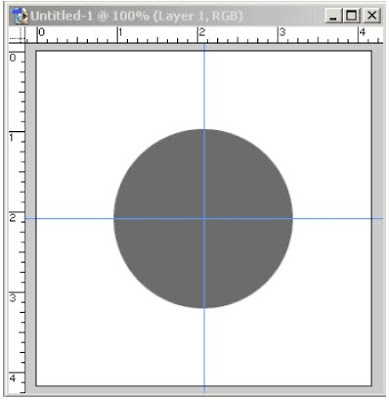
Next, create a new layer and use the marquee tool to create a circle. Fill it with gray. This will serve as a reference point for what you want to wrap your smaller objects around. Position this circle in the center of the canvas. Again as you drag it, the center of the circle should snap to the intersection of the 2 guides.
Step 3:
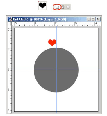
OK, now go to the Custom Shapes palette and choose the heart shape . Make sure you have this option selected in the top toolbar. Now create a small heart on the canvas like I have here.
Step 4:
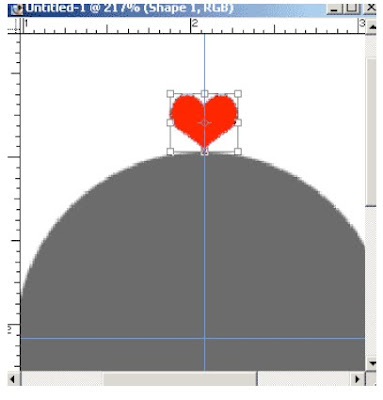
OK, now zoom in on the heart and top half of the circle. Hit Ctrl + T to bring up the free transform tool. Move the heart so it is perfectly in the center of the guide. It should snap into place with the center point of the heart's bounding box.
Step 5:
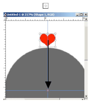
Now hit Ctrl + J to create a copy of the heart layer. Then, hit Ctrl + T to bring up the Free transform again on that copy. Notice the small circle in the center - it looks like this . Hold down Shift and click and drag that down to the center point of the large circle. Right where the two guides meet. See my zoomed in picture below.
Step 6:
Now, don't hit Enter yet. Move your mouse back up to the bounding box around the heart. Move it just outside of the bounding box until you see the little curved arrow. Now click and drag to rotate the heart into a position you desire. Holding Shift down while you do this can help snap it into a good place as well. Hit Enter to confirm your changes when you're happy with the result. You can always hit the Escape key to get yourself out of Free Transform mode too.
Step 7:
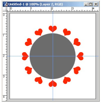
Now the rest is simple. Just take your "Claw" (a.k.a. Hand) and hold down Ctrl + Shift + Alt and hit the T key repeatedly. Watch in awe as hearts appear before your eyes perfectly around the circle.
Step 8:
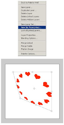
Finally, you can turn off the circle layer. Link all of your heart layers together and go to the layers palette menu and select "New Set From Linked...". This will put them all into one layer set. Now you can hit Ctrl + T on that layer set and move all of them if you like. Resize, skew, do whatever. They are still all vector shapes and will retain their quality no matter what you do. Below is a picture of how I linked them all together and skewed all of them at once. They are still vectors though so I won't loose any image quality like I would if I rasterized them.
Crome Layer Style
Step 1:
Open a new document. Mine is about 300 x 300 pixels in size. Then create an element that you wish to chromize (is that even a word?). The one "gotcha" with layer styles is that they can look very different on various shapes. A style that looks good on text may look horrible on a solid shape like a circle. For this effect I've found that thick text or a logo shaped similar to mine here works best. So go ahead and create whatever shape you choose on a new layer by itself.
Step 2:
Now apply the following layer styles that I have in the screenshots below. Take note of any color swatch changes in the inner glow and satin layer styles as well as any contour changes that I have done. They all ship with Photoshop 7 - you just need to pick it from the list.
Step 3:
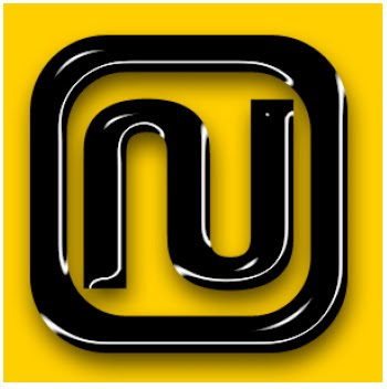
OK, now you should have something like this.
Step 4:
You're probably thinking that this doesn't look very good. Well here is the last tip. I've also found that many of the default blend modes used in the layer styles really hinder us. Sometimes I let them fool me into thinking that the default is the way that the layer style should look best. But often, the real power of layer styles shows through when you change these defaults as is the case with this effect. So with nofurther ado... simply go to the Satin layer style that you created and change the default blending mode of multiply to screen. Then sit back and watch magical things happen (hopefully).
Changing Scenery
Step 1:
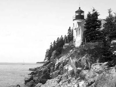
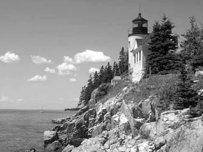
Find an image that you want to make gloomy. For the first time through, its probably best to use this one and follow along. I've also sized it down considerably so the file sizes aren't too big.
Step 2:
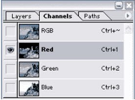
Now, our first step is going to be selecting the sky out from the landscape. This is probably the hardest part but one of the most important. So, I'll start by going to go into my channels palette and click thru the red, green, and blue channels to see what we've got. We're looking for something with good contrast between the sky and landscape.
Channels Palette:
Red:
Green:
Blue:
Step 3:
Ok, by clicking on each channel I find that the blue channel offers me the best contrast for this picture so thats where we'll start. Select that channel and hit Ctrl + A to put a selection around the entire image. Now copy it, go back to your layers palette and create a new layer, and paste it into that layer. Your layers palette should look like this so far.
Step 4:
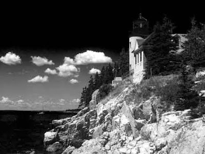
OK, now run a levels command (Ctrl + L) on the new channel. Drag the left slider over to the right until your picture looks something like mine. We're trying to increase the amount of contrast here and make the blacks blacker.
Step 5:
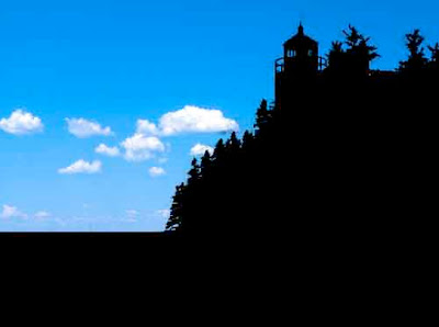
Now for a little manual labor. It can't all be automatic, sometimes we must work for it a little. So,grab your rectangular marquee and put a selection around the water like I have an fill it with black. Also, do the same for the lighthouse. These are areas that we can tell ahead of time will be problems if we try to use an automatic tool like the extract filter which we'll see next. Anyway, you should have something like mine - I've filled my selections with red so you can see what I've done.
Step 6:
Next, go to Filter->Extract. Select a 30 pixel brush and leave the other settings at their default. Draw around the edge for the trees and lighthouse, keeping about half of the brushes width on the part you want to keep and the other half around the sky. Then select the paint bucket (in the extract tool still) and fill the landscape area by clicking on it. You should have something like my picture here. Click OK when you're done.
Step 7:
OK, now we have selected out our sky and we're almost there. Ctrl + click on the layer that you just extracted to select whats left. Then fill it with black so there is no white left. Don't deselect just yet though.
Step 8:
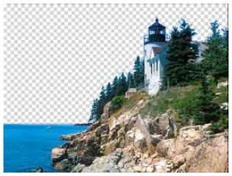
Now we have our mask. With the selection still active, hide your mask layer, select your image layer, hit Ctrl+Shift+I to select the inverse (the sky in this case) and hit delete. You should have something like this. (Note: I had to size this down so I could save it as a gif and show the transparency. The file would have been huge if I didn't)
Step 9:
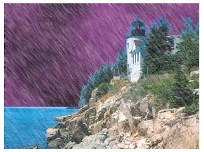
OK, now that we have our image we can start adding the gloominess. First, lets put a new layer below the lighthouse layer for our clouds. Every storm needs clouds right? Now select black for your foreground color and a dark blue or purple color for your background color. I used this color RGB(153:51:153). Then goto Filter->Render->Clouds. You should have something like this now.
Step 10:
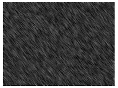
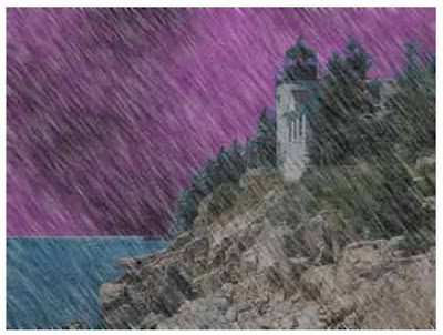
Now that we have clouds, its time to add rain. So create a new layer on top of all the others and fill it with black. Then goto Filter->Noise->Add Noise. For the amount use 37. Check Gaussian and monochromatic too. Now blur it slightly by going to Filter->Blur->Gaussian Blur and enter 0.5 pixels for the radius.
Step 11:
Next, hit Ctrl+L to bring up the Levels adjustment. Move your sliders so they look like mine below.
Step 12:
Finally, to make it look like driving rain we need to angle it a bit. Go to Filter->Blur->Motion Blur and enter in -53 for the angle and 15 for the distance. Feel free to customize these settings to get a different effect.
Step 13:
Now to finish off the rain, select the layer in the layers palette and change its blend mode to screen.
Step 14:
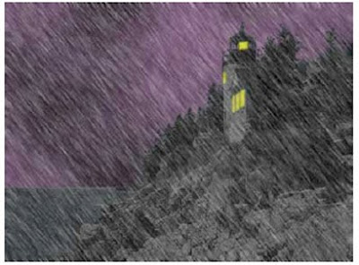
OK, that almost completes the effect but we have a few things to finish up with. First, if you notice the mountains and lighthouse are still way too bright. They still look as if it were a sunny day. Have no fear though, photoshop can take care of that one easily. Just select the landscape layer and hit Ctrl+U to bring up the hue saturation dialog box. Enter in 0 for hue, -70 for saturation and -70 for lightness. That should darken it up just fine.
Step 15:
Finally to fully complete the effect, lets add some lights in the lighthouse to make it look a little more eary. Create a new layer on top of the landscape layer but below the rain layer. Zoom in on the windows and use the Polygonal Lasso tool to make selections around each window. Fill each one with yellow on that and use the Polygonal Lasso tool to make selections around each window. Fill each one with yellow on that new layer. Then run the Filter->Blur->Gaussian blur filter on it with a setting around 0.7 - 1 pixel for the radius.
Step 16:
OK, that almost completes the effect but we have a few things to finish up with. First, if you notice the mountains and lighthouse are still way too bright. They still look as if it were a sunny day. Have no fear though, photoshop can take care of that one easily. Just select the landscape layer and hit Ctrl+U to bring up the hue saturation dialog box. Enter in 0 for hue, -70 for saturation and -70 for lightness. That should darken it up just fine.
Chalkboard
Step 1:
Start out with a blank canvas. 500 x 500 pixels should work fine. Fill your background with this color - #4D6B44.
Step 2:
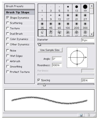
Now, select the brush tool and open your brush palette (Window->Brushes). The brush I'm going to use ships with Photoshop. Its called "Spatter 14 pixels". See my screenshot below for a preview.
Step 3:
Now make sure you have brush tip shape selected on the left side of the brush palette and make your settings similar to mine here.
Step 4:
Now select "Shape Dynamics" and change your settings to match mine.
Step 5:
OK, you now have your brush (or chalk). Its time to write. There are a few ways you could do this. The first and easy way is if you have a pen tablet. Just create a new layer, select the brush tool and start writing on the canvas. You can do this with a mouse but it is much more difficult to write legibly. This gives you that real handwritten look on the blackboard.
Step 6:
The second more difficult way is to add some text on a new layer like I have here.
Step 7:
Then go to Layer->Type->Create Work Path. This will create a new work path in your paths palette from your text. Then hide your text layer and create a new layer on top of it. Make sure the brush tool is selected (with your new brush of course) and go to the Path's Palette. Click on the text work path and click the stroke path button at the bottom of the palette. It should leave you with something like this.
Step 8:
Either way is cool I think and they can both have their advantages depending on the look you're going for. Here is something that I created that made the task a little more fun.
Sunday, May 16, 2010
Carved wood text
Step 1
File > New > Document, Create this at 1000px x 400px, black background. Create a new layer
and, choosing two colors, one light, one dark, as fore and background, go to Filter > Render >
Clouds. Filter > Noise > Add Noise > Gaussian / Monochromatic (setting: 9) Filter > Artistic >
Dry Brush (setting: 10 / 10 / 3). You should now have something similar to the image on the left.
Step 2
Filter > Distort > Shear and use the settings shown. This will give you the first step of the planking...
Step 3
We now need to scale our plank to a quarter of its size so Edit > Transform > Scale. Now duplicate the layer three, four or five times and arrange the planking. You can use the Rectangle Marquee tool to crop the planks where they butt up. Now Link all the floorboard layers and use Merged Linked from the Layers flyout menu.
Step 4
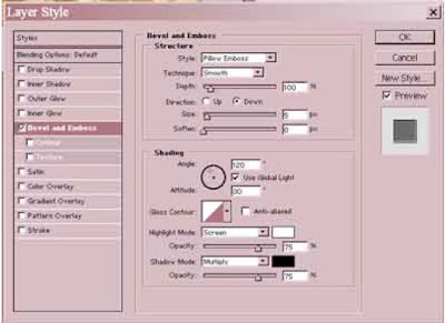
On the 'floorboard' Layer using the Layer Styles menu choose Bevel & Emboss > Pillow Emboss
on the default settings.
Step 5
On the channels menu create a New Channel and type your text. (This is used as a reference
layer for text position and also if you later want to use the Filter Lighting Effects.) Then go back to the Layers Panel and you will see your text as a Marquee Selection.
Step 6
Create a new layer and fill the text selection with black. Then Filter > Stylise > Emboss with the setting of 50 / 3 / 500.
Step 7
On the Layer Panel choose either Color Burn or Overlay from the Blending Mode then add a Drop Shadow, of your choice, from the Layer Syles.
Step 8
Your Marquee should still be active so click onto the 'floorboard' Layer. Edit > Copy. Create a
new Layer. Edit > Paste. Now add a Layer Style > Bevel & Emboss: Pillow Emboss / Chisel Hard / 140 / Up / Size 12.
Step 9
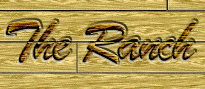
Crop your image to size. If you have used Color Overlay in Step 7 then this is the result.
Cargo Container Part 2 - 3D
Step 1:
Well, you have saved out your tga into your own personal working folder in Part 1 and now we are ready to start working in 3D. So open up your 3D software of choice and I will walk you through the basic setup for creating a simple 3D model to apply our cargo container texture too ( * depending on the 3D software you use, some of the things that I explain may not be exactly the same, but they should be relatively close ).
Step 2:
Once you have your software open, I need you to Create > Primitive Polygon > Cube with the following settings (I scaled the polygon cube in the z axis because most cargo containers are not square and moved it up in the y axis so it is sitting on the ground plane X: 0 Y: 0 Z: 0.
Step 3:
With the following settings scale the polygon cube in the z axis because most cargo containers are not square and moved it up in the y axis so it is sitting on the ground plane X: 0 Y: 0 Z: 0.
Step 4:
Now we need to split the front face of the polygon for the cargo container doors. Go to Edit Polygons > Split PolygonsTool ( * remember some tools may be different depending on the software you are using) and split the polygon cube down the middle.
Step 5:
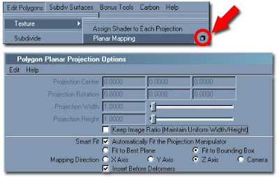
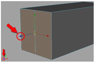
We now need to set up our poly cube’s UV’s (before any polygonal object can be textured, it must have UV information on the surface so that the texture has information to “stick” too. No UV’s = not texture “adhesion” ---in layman terms) to be ready for us to apply the cargo container texture to it. First we select the cargo container doors in face mode (this is a mode that lets you select the polygon object by its component type, in this case we want to select the face component). Once the face is selected, go to EditPolygons > Texture > Planar Mapping []. Depending on which face you have selected, this will determine in which direction you will apply the planar map too. For this case, we selected the face that we split down the middle and projected a planar map down the z axis.
Step 6:
A good way to know which axis you are going to apply a planar map too, is to look at the face when you have it selected and with the move tool selected look at the color of the handles. That color of the handles will represent the direction that particular face is pointing
Step 7:
After applying the planar mapping to all the faces of your cargo container, open up Window > UV Texture Editor and you should have something that looks like this.
Step 8:
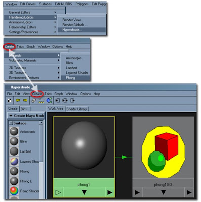
Now with the UV’s finished we can now apply the texture that we created to our cargo container. So I need you to open up your material editor, Window > Rendering Editors > Hypershade. Once in the Hypershade, I will have you create a material with a little reflectivity. So in this case, go to
Create > Materials > Phong.
Step 9:
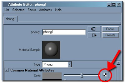
Double click on the Phong that you created to bring up the Attribute Editor of that material. With the Attribute Editor open, click on the create render node for the Color Material Attribute.
Step 10:
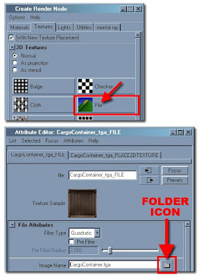
In the Create Render Node of the material we need to add a file to the Phong that we created. Select File and this will bring up the Attribute Editor to add the texture that you created to the material. Select the folder icon next to the Image Name and point to the file you created in your working folder.
Step 11:
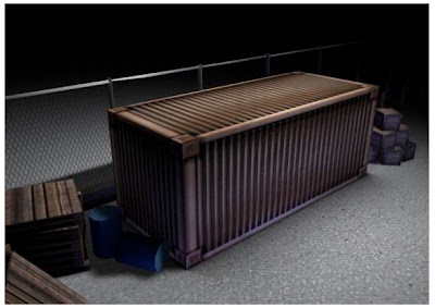
After the texture is loaded onto the Phong, apply that material to your Cargo Container polygon. You can do this by holding down on your MMB (Middle Mouse Button) and dragging the Phong material onto your polygon.
Step 12:
Well, that is the basic tutorial on how to create a 2D texture in Photoshop and bring it into a 3D application and make it come to life. So feel free to play around with your 3D application and add some additional touches to it…..Don’t be scared, you will not break anything.
Cargo Container: Part 1 - Texturing
Step 1:
Before modeling or texturing anything, it is always a good idea to gather as much reference as possible before you begin. For this lesson, I will be creating a cargo container using Photoshop and any 3D software of your choice will work fine for this. The best references are those that you can actually go out and take pictures of. If you cannot find anything you like, the web is the next best place to look. So you can see here, I have a few pictures to help me visualize what I am going to be creating.
Step 2:
Create a new document (Cargo_Container.psd), 1024x512 pixels with a white background. After looking at the reference we gathered, most of the work for the cargo container can be done with the Rectangular Marquee Tool [M] .
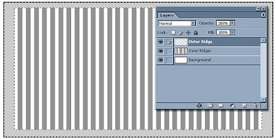
Step 3:
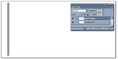
Create a new layer above the background layer and name it Inner Ridges. With the marquee tool selected, draw a rectangle and fill it with 50% neutral gray.
Step 4:
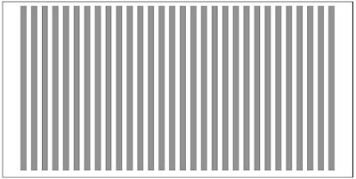
With it still selected, hit Ctrl/Cmd + J to duplicate the image into a new layer. Now hit Ctrl/Cmd + T for the free transform tool and move it to your right (roughly 30 pixels). Now when you used free transform tool, you store that “move” into Photoshop’s memory and all you have to do is make a duplicate layer and hit Ctrl/Cmd + Shift + T and it will remember the previous move. You will do this 30 more times. Just a quick note, it might be a time saver for you to create an action that helps you speed up the process.
Step 5:
At this point you will have a plethora of layers of individual Inner Ridges. Have the first layer selected that you created and link it with all the other layers (except for the Background layer) and in the layers palette, go the pull down tab and select Merge Linked (Ctrl/Cmd + E)
Step 6:
Create a new layer and name it Outer Ridge. Using the marquee tool, create a rectangle covering the majority of the image. When you are done creating your selection, select the inverse of that selection ( Shift + Ctrl/Cmd + I ) and fill that selection with R: 192 G: 192 B: 192.
Step 7:
Select your Background layer and fill it with R: 71 G: 71 B: 71.
Step 8:
Apply these Layer styles to the Inner Ridges layer.
Step 9:
Apply these Layer styles to the Outer Ridge layer.
Step 10:
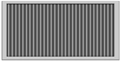
This is how the cargo container should look after applying all the layer styles to the two different layers.
Step 11:
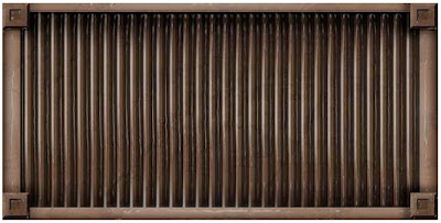
At this point, I want you take a little artistic freedom into your own hands. I want you to add some shadows, highlights, color (a good trick with color, is adding it as a separate layer and change the layer settings to an overlay, multiply or what works best for the look you are trying to achieve) and some grunge. Have fun with it and go crazy if you want too. And you can see here with mine, I just dirtied it up a little bit and added some little touches.
Step 12:
Save a copy of your file out to your personal working folder as a 24bit TGA. Now after this process, you will be ready to bring your 2D image to life. Go to Part 2.
Black-Background Contact Sheets
STEP 1
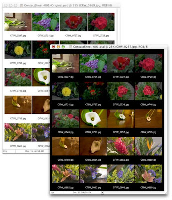
File> Automate> Contact Sheet II. In the Contact Sheet dialog box, select the folder from which you want to generate the sheet and uncheck the box "Flatten All Layers." Click the OK button to generate the contact sheets.
STEP 2
Once the contact sheet is generated, press D on the keyboard to set black as the foreground color. (You could, of course, use any color.) In the Layers palette, click on the layer "Background" to make it the active layer. Press Option-Delete (Mac) or Alt-Backspace (Windows) to fill the layer with black.
STEP 3
If you added the file name as a caption, it's now invisible. In the Layers palette, click on any type layer to make it the active layer. Link all the other type layers to the active layer. While keeping the Shift key depressed, change the type color in the Character palette to white (or any other light color). Using the Shift key enables you to convert all the linked type layers at the same time. You can now flatten the contact sheet, if desired.
Subscribe to:
Posts (Atom)